Our PR Manager had some questions for me about our rebrand. I thought those answers were worth sharing here.
StudentUniverse has been in business for 15 years. Is this the company’s first significant re-brand?
We have updated our website a few times, but this is certainly the first complete overhaul.
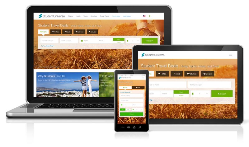
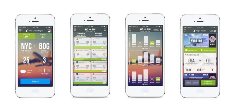
First, we have a new image-heavy responsive website with an arsenal of new features, both front and back end. In conjunction, we’re launching a new native mobile app for flights. This overhaul marks the largest project our development team has released to date.
Second, we have a new logo and style guide. We’ve had variations of the same logo since our founding, so this is the first complete change in icon. We’ve kept our brand colors, but brought our secondary “bondi blue” to the forefront and lightened up on the “sushi green” that we’re known for and dominated the last iteration of our website.
Before:

After:

Finally, we’ve analyzed everything about the company’s identity. The logo is just one piece. We’re rethinking how we describe the company, what we do and what our mission is. We’ve written a new manifesto for employees, dressed them in new branded swag and put up inspirational travel photos and phrases all over our offices. We’re building our culture from the inside out.
Why is this the right time for the re-brand?
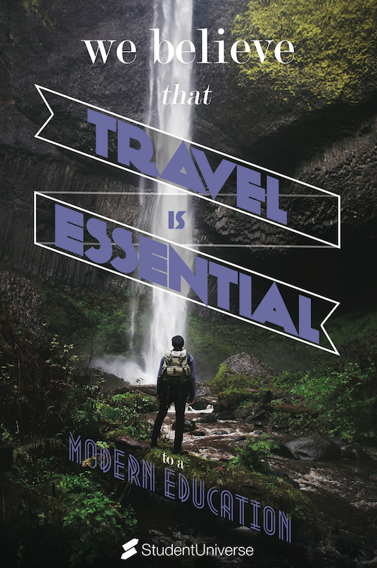
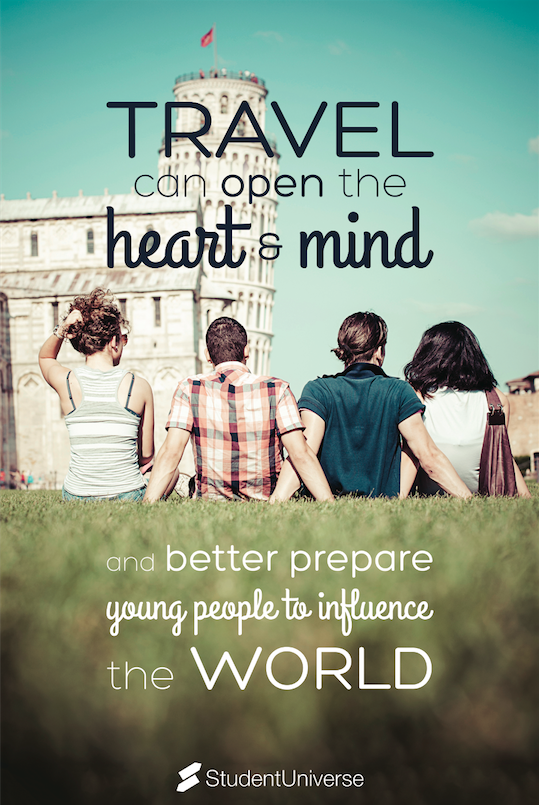
I think we’re at a pivotal point in the company and we’re ready to take the next step as a business. The industry is racing to keep pace with the new multi-screen world we live in and design standards are elevating with technology. At the same time, StudentUniverse is growing faster than it ever has. We’re seeing double digit growth in sales domestically and we’re expanding internationally. As we continue to evolve our global business, we want to go forward with a fresh and modern brand that pays homage to the young jetsetters that buy from us.
StudentUniverse is an engine to book travel, but what’s cool about it is the nature of whom we sell to and why they buy from us. Our products are negotiated and built for students. The reasons that they travel are absolutely inspiring. These are international students who are making a leap of faith to study in another country. They are students who choose to spend a semester abroad to study, or to work. They are making a kind of temporary home within a foreign culture. They are having experiences of a lifetime with others their age, discovering that there’s more out there than they could’ve imagined. They are coming home with new experiences that they can add to a resume and talk about in interviews. They will ultimately become the next generation of business and leisure travelers. We’re humbled to have a small part in their experiences and we want to do a better job telling their stories.
Can you share a little bit about how the new design was conceived?
We had three main objectives for designing our website and mobile app.
- Mobile user experience: If it doesn’t work on mobile, then it doesn’t work.
- Image-heavy inspiration: Travel is an experience – and that experience should start with booking.
- Homage to our user base: Active, young travelers having experiences of a lifetime.
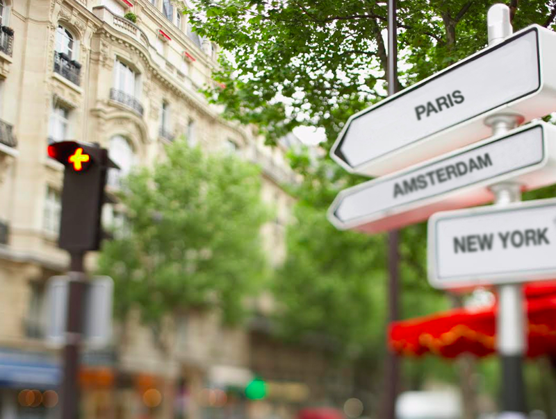
In terms of the logo, the conceptual inspiration was a sign post. It’s an iconic symbol in travel to see a sign that points in different directions and gives you miles to cities far away. Similar to the impulsive traveler, standing at a crossroads and deciding where to go next, students are standing at a crossroads in their lives. It’s a time of choices and directions – ones that may shape their future. We believe that travel can have a profound affect on those choices. Hence, our logo represents freedom and choices, movement and travel. It signifies possibilities, beginning journeys and learning. It is the allure that the world holds more for you than you thought possible – and a way to get there.
How were employees involved in the re-brand? What was their feedback?
We had representatives from every department meet biweekly for months during the design stages and we brought full teams into various discussions, as needed. Nearly everyone in the organization has touched on some component of this release. At various stages of development, we have opened the floor to the entire company to provide feedback on the latest code and designs. It’s been really cool to see travel agents finding coding bugs and developers commenting on image choices. It really improved our end product to have cross-functional collaboration on a large project.
Actually, I think some of the things our employees said in our recruiting video speak to the collaborative environment that we keep. We’ve been humbled by the sense of pride that our employees have shown throughout the organization. We’re sharing feelings on the brand that many have held for years. Many have commented that they feel this is a brand that they can stand behind and we couldn’t be happier about that.
What effect, if any, do you expect this re-brand will have on the company and its culture?
I think we’re going to keep doing what we’ve always done and continue building the best engine for students to find and book travel deals. But, I think the positive energy is higher than its ever been. It’s important that our team understands our customers and their experiences – and its important for our customers to see that we understand them and care about all the amazing things they are going to do. We’re on a mission to make global experiences possible – and that’s never been more clear.